
Graphic Designer
Brief
To ensure that customers retain the flyers delivered to their doorstep, implementing strategies to make the content more engaging and valuable, prompts them to keep the materials at home.


Survey
In pursuit of insights into consumer behavior regarding takeout bag contents, I orchestrated a survey via Instagram stories. Participants were prompted to vote on the most and least utilized components of their takeout bags among four options: the food-carrying bag itself, the containers, paper napkins and additional cutlery, and advertising menu cards. The survey aimed to discern the aspect deemed most valuable post-meal and the least significant element after consumption.


According to the survey results displayed in the pie chart, menu cards were considered the most useless component by a significant majority, with 50% of respondents indicating they discarded them. In comparison, only 12% disposed of paper napkins and additional cutlery, 14% discarded the containers, and 20% disposed of the food-carrying bag itself. This data underscores the prevailing sentiment regarding the perceived usefulness of menu cards among the surveyed individuals.
Idea
Designing a menu card with a focus on uniqueness, multipurpose functionality, interactivity, and cost-effectiveness. I've decided to go beyond the traditional and explore innovative paper folding techniques to create a distinctive piece. By incorporating eye-catching folding designs, the menu card becomes not only a functional item but also a keepsake.
Adding interactive elements like hidden messages or puzzles enhances the customer experience and makes the menu card more memorable. This approach transforms the menu card from a simple display of food options into a cherished item that customers would want to keep at home. Delving into diverse origami techniques, I've chosen simpler folding forms that can be easily transformed into interactive menu cards.
1.Oh Cream !
What they stand for
oh Creams is a tale of dedication, exploration, and indulgence in decadent desserts. Through years of tasting and refining, they have crafted a menu bursting with fun, colourful, and irresistibly delicious treats. From waffles and crepes to gelatos and vegan delights, Creams promises an unforgettable experience centred on mouth watering desserts.


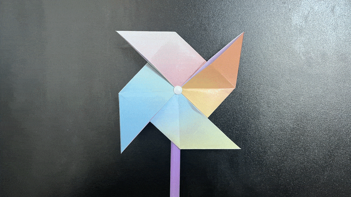
To determine the appropriate form, I turned my attention to hand fans. Given the popularity of ice creams during summer, I envisioned a dynamic and vibrant menu card that could also serve as a functional fan to provide relief from the heat or for the kids to play. This concept resonated well with my objective. Consequently, I began exploring various styles of fans as potential inspirations for the design. Utilizing the windmill origami design for an ice cream shop’s menu card. Notably, this choice held multiple layers of appeal. Beyond its playful nature and attraction for children and their parents, the windmill can evoke sensory memories, connecting customers to the brand through sensory marketing.


2. Makisu Sushi Bar
What they stand for
Makisu Sushi Bar aims to provide an authentic Japanese culinary experience, where the food is prepared right before your eyes. Through this approach, we bring the essence of Japanese culture and flavours directly to your plate.

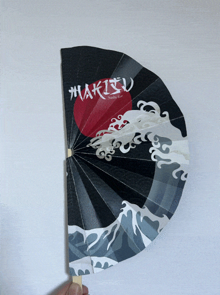


The fan holds profound cultural significance within Japanese heritage, making it an ideal muse for my exploration into authentic design representations. My aim was to infuse the rich essence of Japanese culture into the menu card, drawing inspiration from various traditional art forms and incorporating the unique top-to-bottom text arrangement often found in Japanese scripts. To create a visually striking impact, I envisioned incorporating illustrations inspired by Katsushika Hokusai's legendary masterpiece, "Under the Wave off Kanagawa," also known as "The Great Wave." This iconic artwork has garnered global acclaim, serving as a quintessential representation of Japanese artistry and capturing the vibrant spirit of the culture.

